There are many design programs on the market with different applications. But which program you choose to build a prototype in often depends on which functionalities are important for your design.
In recent years, Figma has been increasingly used for making prototypes. With its relatively young existence (launched in 2015), the program has quickly reached a large number of users, currently holding a 33.62% market share in collaborative design and prototyping software.
Originally, Figma is a cloud-based UI design and prototyping program with the ability to collaborate on the same design in real-time with different teams. This has made it extremely popular. Despite the image of a very user-friendly tool with many options, we ask ourselves: is Figma the best choice in all cases to create your prototype?
In this article we highlight another program: Axure RP. Axure has been around for a while: the tenth version was recently launched in beta. The program was developed in 2002 when the founders were looking for a better tool to improve software applications by creating wireframes and prototypes. The originally interactive wireframe and prototyping software offers very advanced options to quickly develop a rough idea. Axure allows you to create a very realistic prototype, ideal for user testing.
In the coming paragraphs we will focus on Axure; can it compete with Figma? And what can other prototyping tools learn from? We highlight three features of Axure that set the program apart from the rest: the use of advanced widgets, dynamic panels and condition logic.
The integrated use of widgets for your designs
Figma offers a wide range of building blocks and options to shape a frame the way you as a designer have in mind. Creating buttons, input fields and buttons in a prototype is no longer a complex challenge for the seasoned Figma user. Creations can be made in an instant that can basically respond to the user's actions. Consider, for example, hover and disabled states for buttons or pressing a specific letter on your keyboard to navigate to another frame.
But if your interaction needs extend beyond the above, you may well reach the limit of Figma. Because what if you want an input field to actually offer the option for the user to enter text? Or what if your frame consists of multiple switches (think of radio buttons or checkboxes) where you think it is important that the user should have the freedom to choose which ones they turn on and off? With a prototype you always strive for the closest possible connection to reality and missing these kinds of freedoms can affect the user's testing experience.
Axure solves this in the form of a feature that does not exist in the same capacity in Figma: widgets. They can be compared to components in Figma, with the big difference that they come with preset values and interactions specific to that component.
They can be compared to components in Figma, with the big difference that they come with preset values and interactions specific to that component.
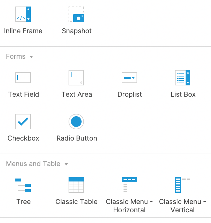
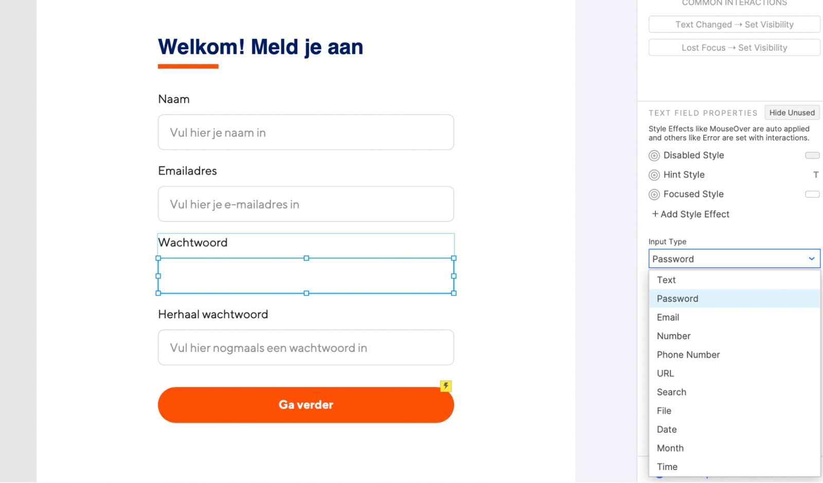
Let's take the text field as an example: after adding it to your design, it is immediately an interactive object. It changes state (it has a built-in hover, disabled and selected state) and the user can immediately enter text while testing the prototype. In addition, a purpose for the text box can also be chosen. For example, do you want to use it for a password? Then the program automatically changes the input into dots. Does the user need to enter a date? Then the program itself adds a calendar widget.
The same unique functionalities are also present in checkboxes, radio buttons and drop lists, among others. So, for example, are you designing an application form with a range of input fields, radio buttons and checkboxes, so that the user's choice requires you to prototype each choice in a separate frame? Then you may be better off with Axure than with Figma. A user has more freedom in this, without having to design a new path for every possible choice of the user as a designer. Everything fits and is possible on one highly interactive page. So it provides fantastic benefits for both the designer and the user.
Dynamic Panels; components, but slightly different
Other prototyping software often uses components; a way to give 'dumb' objects on your page additional functions. For example, a button can have multiple variants (such as a visual difference between inactive & active) through components.This does not exist in Axure, because in this platform they use Dynamic Panels. These are components, but slightly different.
For example, a dynamic panel does not necessarily have to be a variation on one object. It allows you to place 'containers' on your page that are interactive and can interact with other containers on your page. This may sound abstract, so let's make it more digestible with an example.
A recent case required multiple drop-down windows on one page that should only appear when the user pressed a certain button.


In the example above, the user presses the 'Less than 1 year' button, which reveals a new (previously hidden) section of the page. This is possible because dynamic panels can change their 'state', or become 'visible' from an invisible position on the page. When such a panel becomes 'visible' (as in the example in the image above), Axure also offers the option to have the content underneath it scroll down. Your new content does not overlap with content below it, but the website automatically scales accordingly.
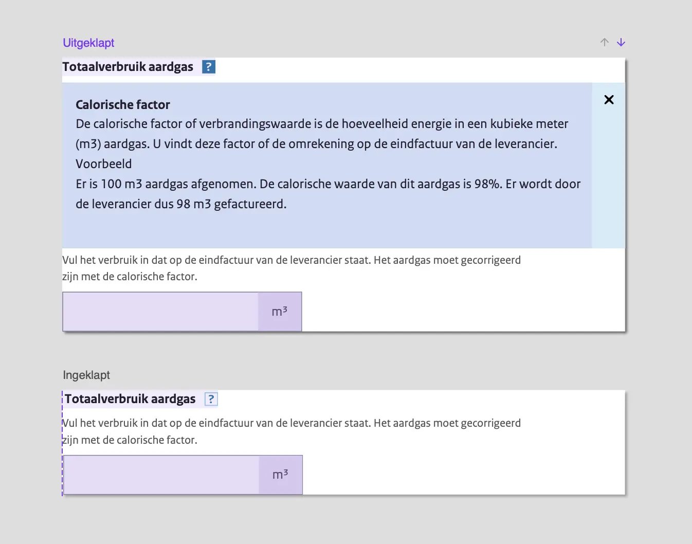
The big advantage of this is that, unlike other design tools, this is all done on one page. This means that as a designer you are not forced to create multiple 'frames' for every possible option or state of a page based on your user's choice. With many options, this can quickly branch out into a wide selection of possible frames that the user can end up on based on his choice. This gives you as a designer the ability to design a single page with content that comes and goes depending on the user's choices.
Conditional logic
One of Axure's strong features is the ability to add conditional logic to your design. For example, in Axure you can apply 'if-then' logic to your design. Simply put, this means that you can indicate the following in Axure:
- if 'action A' is performed and the 'value' of a 'specific element' is 'x', then perform reaction 1';
- if value is equal to 'y', then perform 'reaction 2'.
To better understand this, we will take you through the case below.
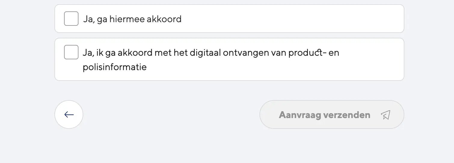
In the design in the example above, the CTA (the 'Send request' button) is only intended to become active when both checkboxes are checked. This is possible by using conditional logic functions in Axure.

This can be achieved by creating an 'as' status. In this example it means that the CTA (send request) should only become visible when the status of both checkboxes is set to 'selected'.
By applying this logic to your design you have possibilities that can usually only be realized during development. This way you are able to make a wireframe respond as it should in real life. Axure is a good choice, especially for prototypes that require many interactions. In Figma, on the other hand, the options for making an interface responsive are limited, while in Axure this can simply be programmed.
Within Axure you get slightly more development options compared to other design programs, which also ensures that it is a suitable program to deliver a design for development. This makes it possible to produce HTML files, Word specifications, and even CSV formatted reports for import into a spreadsheet. With this, it provides useful material for developers.
Conclusion
In conclusion, you can say that Axure is a useful program if you want to build an interactive prototype. It gives you the opportunity to design a prototype in a short time that feels very realistic to the user. In addition, Axure offers very advanced options to make your prototype respond to user input.
Perhaps reasons to make your next prototype in Axure?

